
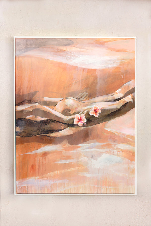
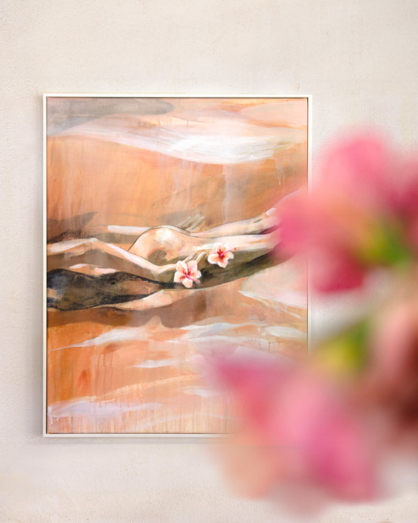
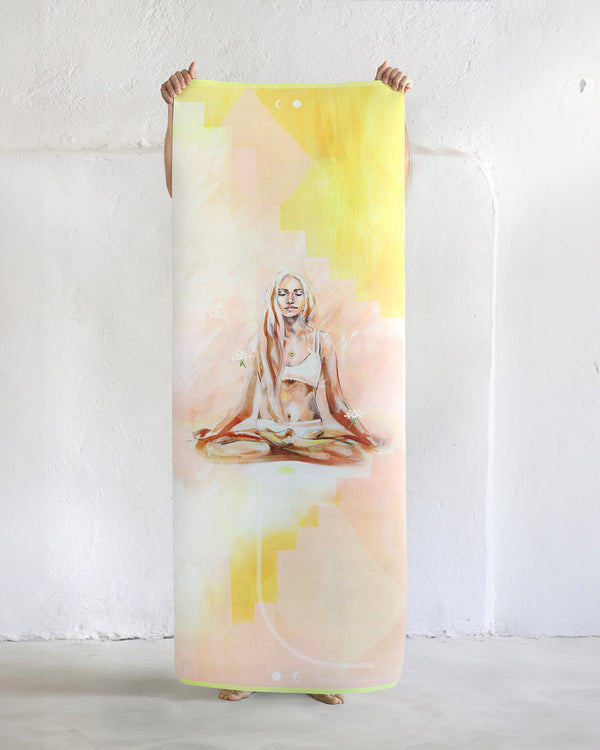
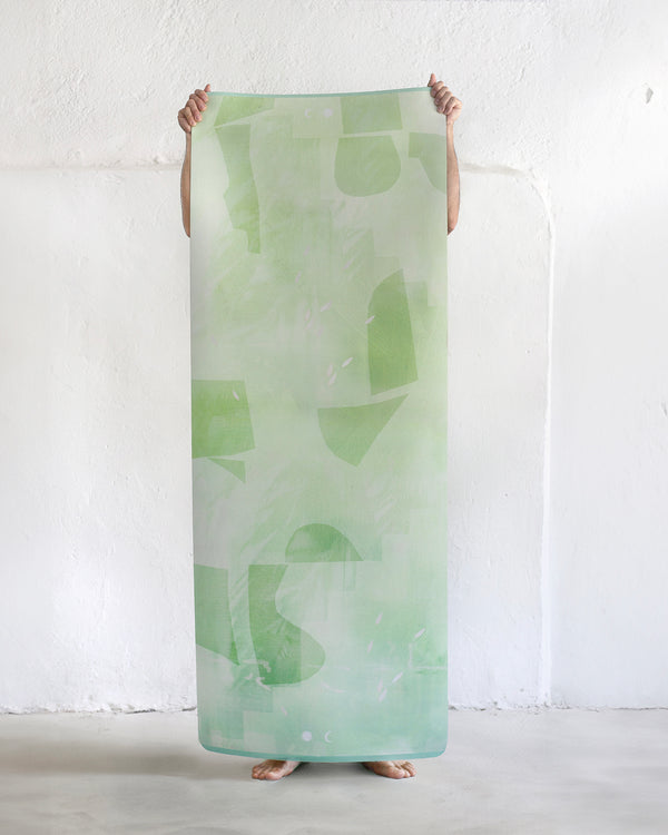
"Women like me are my main subject as they bask in the spirit of nature and become a part of it. We keep our face to the sun and let the shadows fall behind us."

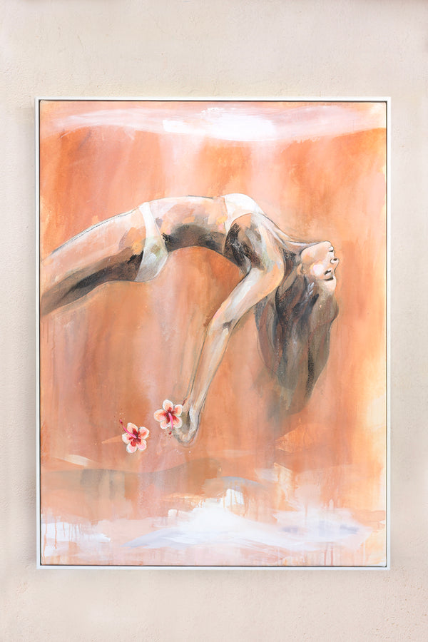
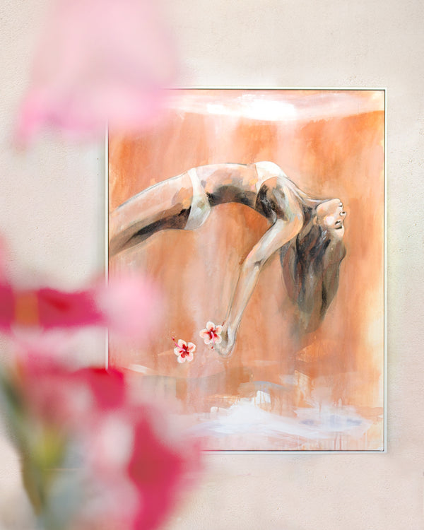
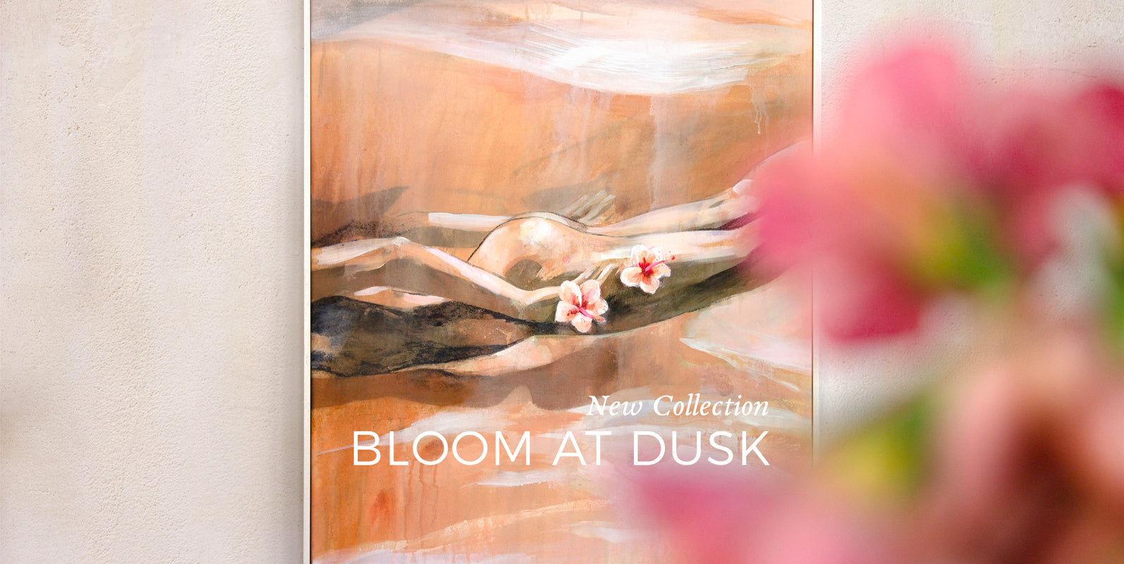
Duskfallen

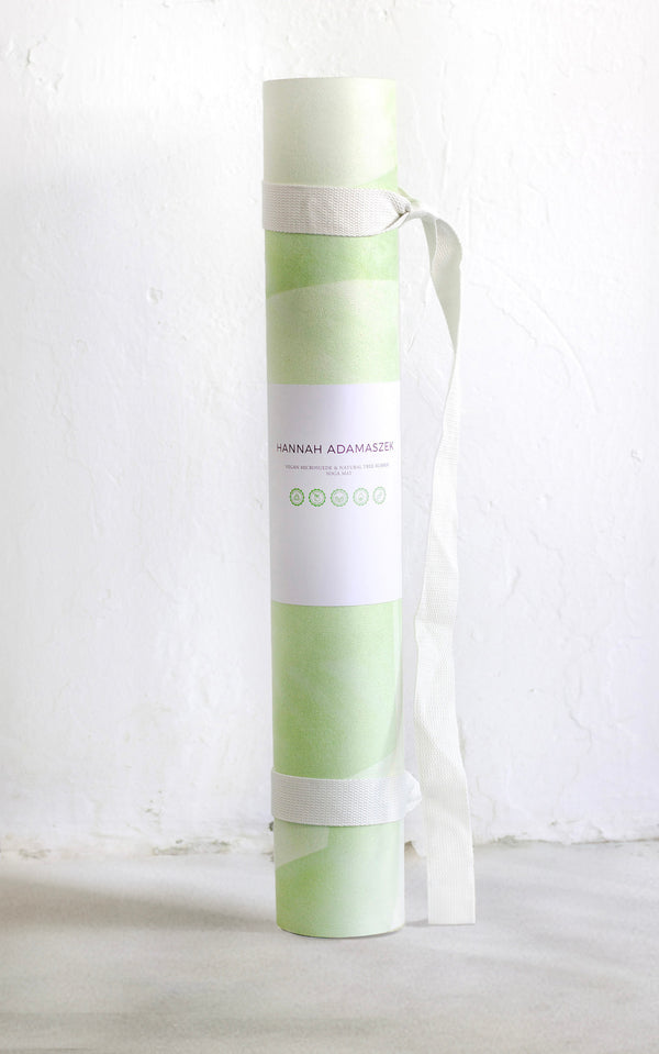
Aura


A LITTLE BIT ABOUT ME
A little bit about me... I am inspired by the small things in life that make us smile. The feeling of the sun on our skin, saltwater in our hair and the smell of the plants as we move through the mountains. I want to invite us to calm down, breathe in, and connect with nature and our innermost selves.
I paint the zen like beauty of everyday life, focusing on the light and movement that fall upon the human body. Women, like me, are my main subject as they bask in the spirit of nature and become a part of it. We keep our faces to the sun and let the shadows fall behind us.
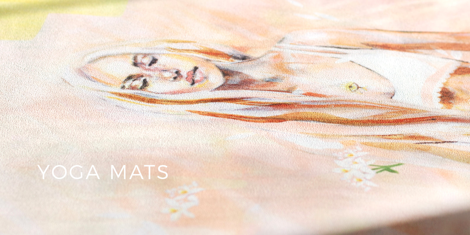
CLIENT LOVE
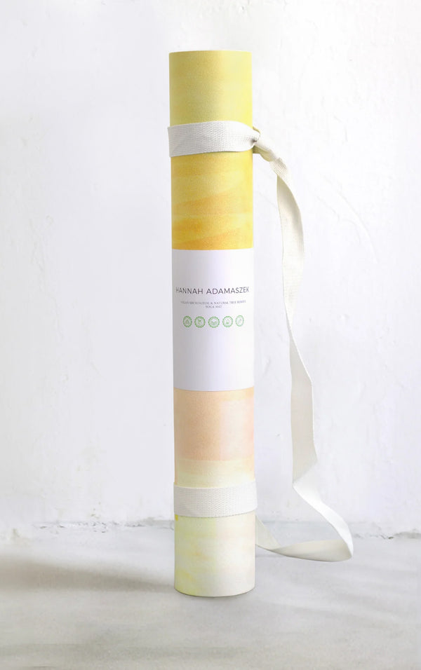
Beautiful well made grip yoga mat. Vibrant, motivates you, lovely to use. - Mandy B
★★★★★
"This is the second piece of art I’ve bought from Hannah and as the first, I love this one too! Excellent communication and shipped very quickly. Looks perfect in my bedroom!" - Claire
★★★★★
"The painting is so beautiful, I'm really pleased. Would love to buy more pieces of Hannah in the future. Thank you so much!" - E.H
★★★★★
"Thank you for yet another wonderful creation, its stunning. I've received great feedback so thankyou again for playing a part in this success." - Emma
★★★★★
"Thank you so much! Love it. You’ve really followed the brief well. Love it love it love it!" - Anthony